Best Fonts and Text Styles for Laser Engraving
Which fonts hold up on real materials, the stroke width and text height limits that decide whether lettering survives, and the file-prep steps that stop a job going wrong.

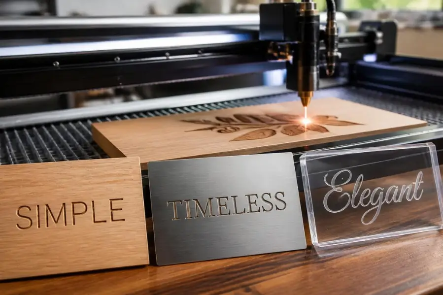
The safest all-purpose fonts for laser engraving are bold or medium-weight sans serifs such as Arial Bold, Helvetica, Montserrat and Verdana, because their stroke width stays consistent and their letter shapes stay open. The practical rule is that stroke width should be at least twice your laser's beam spot size, which on a typical CO2 machine means keeping strokes above roughly 0.5 mm. Below about 5 mm of text height, switch to a single-line font rather than a filled one. Serif fonts suit awards and plaques, script fonts work for gifts at larger sizes, and single-line fonts are fastest for industrial marking.
Key takeaways
- Stroke width matters more than font name. Aim for at least twice your beam spot size, which is around 0.5 mm on a typical CO2 glass tube. Below 0.3 mm, filled letters become unreliable on any machine.
- Below 5 mm text height, switch to single-line fonts. Filled letterforms lose their counters and merge at small sizes. Single-line fonts trace the letter shape instead of filling it, so they stay legible much smaller.
- Bold sans serifs are the safest default. Arial Bold, Helvetica, Montserrat, Verdana and Century Gothic hold their shape across the widest range of materials and sizes.
- Convert text to paths before you send the file. Live text depends on the font being installed on the machine's computer. If it is not, the software substitutes something else and you find out after the job has run.
- Check the licence if you are selling the product. Many fonts bundled with Windows and Office are licensed for personal use, not for commercial products. Google Fonts and SIL Open Font Licence faces are safe for resale.
Laser engraving can turn a simple design into a professional-looking product, and the final result often depends on one overlooked factor: the font. Whether you are engraving wood, metal, acrylic, glass, leather or stone, the right typeface improves readability, shortens engraving time and makes the finished piece look deliberate rather than improvised.
The catch is that a font which looks perfect on screen behaves differently under a beam. Screen rendering has no minimum stroke width and no kerf. A laser has both. This guide covers which fonts work, the specific limits that decide whether lettering survives, and the file preparation steps that prevent the most common failures.
What Makes a Font Suitable for Laser Engraving?
Good engraving fonts share a small number of structural traits: clean letterforms, consistent stroke widths, adequate spacing, open counters, and no hairline details. Fonts with very thin strokes, heavy flourishes or tightly packed characters produce poor results, particularly at small sizes.
Two measurable limits do most of the work in deciding whether a font will survive. Understanding them is more useful than any list of recommended typefaces.
The Stroke Width Rule
Your laser has a beam spot size, which is the diameter of the focused beam at the material surface. Every line the laser makes is at least that wide. If a letter's stroke is narrower than the spot, the laser cannot reproduce it accurately.
Machine Type | Typical Beam Spot | Practical Minimum Stroke |
|---|---|---|
CO2 glass tube | About 0.2 to 0.3 mm | 0.5 mm |
CO2 RF metal tube | Finer than glass tube | 0.3 to 0.4 mm |
Fiber galvo | Often under 0.05 mm | 0.1 mm or less |
Diode | About 0.06 to 0.15 mm | 0.3 mm |
The working rule: keep stroke width at or above twice your beam spot size. On a typical CO2 glass tube machine that puts the practical floor around 0.5 mm. Below roughly 0.3 mm, filled letterforms stop being reliable on any gantry machine, because there are too few scan lines across the stroke to build a solid shape.
This is also why fiber lasers hold much finer text than CO2 machines. The spot is an order of magnitude smaller, so the same font can be engraved considerably smaller before it breaks down.
Minimum Text Height
Stroke width and text height are linked, because scaling a font down scales its strokes down with it. A font whose strokes measure 0.5 mm at 20 mm tall will have 0.25 mm strokes at 10 mm tall.
Text Height | What to Use | Why |
|---|---|---|
Above 10 mm | Any font style, including script and decorative | Strokes stay well above the minimum at this scale |
6 to 10 mm | Sans serif or simple serif, filled (raster) | Fine details start to close up; avoid hairline serifs |
4 to 6 mm | Bold sans serif only, filled | Counters begin merging on anything lighter |
Below 4 to 5 mm | Single-line fonts, line mode | Filled letterforms lose their shape; single-line stays legible |
That last threshold is the one worth remembering. Rather than fighting a filled font at 4 mm, switch to a single-line font, which traces the skeleton of each letter instead of filling its area.
Resolution and Scan Lines
Engraving resolution interacts directly with stroke width. At 254 DPI, a 0.3 mm stroke is roughly three scan lines wide, which is about the lower limit at which a filled letter holds its shape. Increasing to 400 or 500 DPI puts more scan lines across the same stroke and produces noticeably sharper edges on small text.
Higher DPI costs job time, so the sensible approach is to raise it only where detail demands it. Our guide on what DPI is in laser engraving covers how resolution affects text clarity and overall quality.
Key Factors to Consider
Factor | Why It Matters | Target |
|---|---|---|
Stroke width | Thin strokes burn away or engrave unevenly | At least 2x beam spot; 0.5 mm on CO2 |
Text height | Small text loses detail as strokes scale down | 5 mm minimum for filled fonts |
Counter size | Enclosed spaces in a, e, o and g fill in | Open, generous counters |
Letter spacing | Engraved letters spread slightly and can merge | Add tracking on tight fonts |
Stroke contrast | Thick and thin parts engrave at different rates | Low contrast; avoid Didone-style serifs |
Material | Some surfaces hold detail better than others | See the material table below |
Which Sans Serif Fonts Work Best for Laser Engraving?
Sans serifs are the most reliable engraving fonts because they have low stroke contrast, open apertures and no fine serifs to lose. They are the right default for anything where readability matters more than decoration.
Font | Why It Engraves Well | Best At |
|---|---|---|
Arial Bold | Low stroke contrast, geometric shapes, no decorative details | Almost anything; the safest default |
Helvetica | Very even stroke width and tight, predictable forms | Branding, nameplates |
Montserrat | Geometric with generous counters that resist filling in | Modern signage, product branding |
Verdana Bold | Unusually wide letter spacing and large x-height | Small text; stays legible when scaled down |
Century Gothic Bold | Circular geometric forms with very open counters | Clean modern look, holds shape well |
Roboto | Neutral and highly legible across sizes | General-purpose work, free licence |
Open Sans | Open forms, good at small sizes, free licence | Body text on signage, commercial work |
Futura | Strong geometry and distinctive character | Design-led branding at medium sizes |
Bebas Neue | Condensed caps, high impact | Headlines only; too tight for small text |
Best uses: metal nameplates, industrial labels, product branding, equipment identification, corporate gifts, and any text under 10 mm tall.
Watch out for: condensed weights like Bebas Neue at small sizes, where the tight letter spacing causes characters to merge once the engraved strokes spread slightly.
Which Serif Fonts Create a Premium Engraved Look?
Serif fonts communicate tradition and craftsmanship, which is why they dominate awards, plaques and memorial work. The trade-off is that serifs are fine details, and fine details are the first thing a laser loses.
Font | Engraving Behaviour | Notes |
|---|---|---|
Trajan Pro | Heavy strokes, minimal thin sections, large caps | The classic award and plaque face |
Georgia | Sturdy slab-like serifs, low contrast | One of the most forgiving serifs at smaller sizes |
Garamond | Elegant but finer serifs and higher contrast | Keep above 10 mm |
Baskerville | Noticeable thick-thin contrast | Formal work at generous sizes only |
Times New Roman | Familiar and readable, moderate contrast | Fine at medium sizes; serifs soften below 8 mm |
Playfair Display | High contrast with very thin hairlines | Display sizes only; hairlines burn away small |
The rule for serifs: the higher the stroke contrast, the larger you need to engrave. Slab-style and low-contrast serifs like Georgia and Trajan hold up far better than Didone-style faces like Playfair, where the hairlines can fall below your minimum stroke width before the rest of the letter does.
Are Script Fonts Good for Laser Engraving?
Yes, at the right size. Script fonts produce beautiful results on personalised gifts, jewellery and decorative items, and they are the most requested style for wedding and gift work. They are also the style most likely to disappoint, because the connecting strokes between letters are usually the thinnest part of the design.
Recommended: Great Vibes, Allura, Alex Brush and Pacifico. Pacifico is the most robust of these, with noticeably heavier strokes than the others.
Size guidance: most scripts need at least 15 mm of text height to engrave reliably. Below 10 mm, the connecting strokes and flourishes drop under the minimum stroke width and either break up or fill in.
Check the connectors, not the letters. When assessing a script font, zoom in on the thin joining stroke between two letters rather than the letter bodies. That connector is what determines whether the font will work at your intended size.
Best applications: wedding gifts, personalised tumblers, jewellery, decorative wooden signs, and anywhere the text is a feature rather than a label.
What Are Single-Line Fonts and Why Are They Popular?
A normal font describes the outline of each letter, and the laser fills that outline in. A single-line font describes the skeleton of the letter as a single path, and the laser simply traces it.
That difference has three consequences. Engraving is dramatically faster because there is no area to fill. Text stays legible at sizes where filled fonts collapse. And the result is a consistent line weight regardless of how small you scale it.
Common examples: Hershey fonts, Simplex, stick fonts, and SHX engraving fonts. LightBurn includes built-in single-line fonts and supports SHX files directly, which is the easiest route if you are already working in it.
Best for: serial numbers, data plates, industrial marking, part identification, and any text below about 5 mm tall.
Limitations: single-line fonts have no weight variation and no decorative character, so they look functional rather than designed. They are the wrong choice for anything where appearance is the point.
Which Font Styles Should You Avoid?
Style | The Problem | Example Types |
|---|---|---|
Ultra-thin and Light weights | Strokes fall below the minimum width and burn away | Thin fashion and editorial faces |
High-contrast serifs at small sizes | Hairlines disappear while the thick strokes engrave normally | Didot, Bodoni, Playfair at small scale |
Highly decorative calligraphy | Fine flourishes and tiny details cannot be resolved | Victorian and ornamental display faces |
Extremely condensed fonts | Letters merge once the engraved strokes spread | Compressed headline faces at small sizes |
Fonts with overlapping characters | Overlaps engrave twice, causing deeper burn marks | Many brush and handwriting scripts |
Faux or synthetic bold | Software-generated bold thickens strokes unevenly | Any font bolded with a toolbar button |
On synthetic bold specifically: if a font family has no real bold weight and your software offers one anyway, it is generating it by artificially thickening the outline. That thickening is uneven and often closes counters. Use a font family that ships with a genuine bold weight instead.
Why Engraved Letters Fill In or Burn Away
Two failure modes account for nearly every illegible engraving, and they have opposite causes.
Counters Filling In
The counter is the enclosed space inside letters like a, e, o, g, p and B. When text is engraved too small, or with too much power, those spaces close up and every one of those letters turns into a solid blob. A word becomes an unreadable smear.
Fixes: increase text height, choose a font with more generous counters such as Verdana or Century Gothic, reduce power by 5 to 10 percent, or increase speed by around 20 percent to reduce how much the burn spreads.
Hairlines Burning Away
The opposite problem. Strokes narrower than the beam spot either do not engrave at all or engrave inconsistently, so parts of letters vanish. High-contrast serifs and light-weight scripts are the usual victims.
Fixes: switch to a heavier weight of the same family, increase text height, or move to a single-line font if the size cannot change.
Which Fonts Work Best for Different Materials?
Materials differ in how much fine detail they hold, which changes the minimum practical text size as much as the font does.
Material | Recommended Style | Minimum Text Height | Why |
|---|---|---|---|
Anodised aluminium | Sans serif, single-line | 2 to 3 mm | Highest detail retention of any common material |
Stainless steel (fiber) | Sans serif, single-line | 2 to 3 mm | Small beam spot holds very fine detail |
Acrylic | Sans serif, modern serif | 4 to 5 mm | Clean edges, good detail, minimal spread |
Coated or painted metal | Sans serif | 4 to 5 mm | Coating removal gives crisp edges |
Hardwood (maple, cherry) | Serif, sans serif, script | 5 mm | Tight grain holds detail well |
Softwood and plywood | Bold sans serif | 6 to 8 mm | Grain variation blurs fine detail |
Leather | Script, serif | 6 mm | Burn spreads slightly into the surface |
Glass | Bold sans serif | 6 to 8 mm | Frosted edges are inherently less crisp |
Slate and stone | Serif, bold sans serif | 8 mm | Surface texture interrupts fine strokes |
Anodised aluminium is worth singling out because it produces the crispest, highest-contrast text of any common material, which makes it the right choice when small lettering has to stay legible. Our guide on whether you can laser engrave anodised aluminium covers the process in detail.
Fonts for Cutting Text vs Engraving Text
These are different problems and the same font will not necessarily serve both.
When you engrave text, the material stays in one piece and small text is entirely workable. When you cut text out, two things change. Strokes need to be much wider to stay structurally sound, and the counters fall out as loose pieces.
Cut letters need far wider strokes than engraved ones. On 3 mm plywood, keep strokes at 1.5 to 2 mm minimum, which in a bold font means text roughly 15 to 20 mm tall. Anything smaller becomes fragile or falls apart entirely. If a design needs small cut text, a heavier font weight works better than simply scaling up a light one.
The counter problem: cut out an O and you get a ring plus a loose disc. Cut out an A, B, D, P, Q or R and the same thing happens. For cut text, use a stencil font, which has deliberate breaks connecting each counter to the outside so nothing falls out.
A common design pattern: cut the large words and engrave the small ones. It solves both problems at once and is standard practice on signage.
Convert Text to Paths Before You Send the File
This is the single most common file preparation mistake in laser work, and it is entirely avoidable.
Live text depends on the font being installed. If you save a design with editable text and open it on a different computer, the software looks for that font. If it is not installed, it silently substitutes another one. Letter widths change, the layout shifts, and you find out after the job has run on a customer's product.
The fix is to convert text to outlines, curves or paths before exporting. The command is called different things in different software: Convert to Path in Inkscape, Create Outlines in Illustrator, Convert to Curves in CorelDRAW, Convert to Path in LightBurn.
Do this last. Once text is converted to paths, it is no longer editable as text, so proof the spelling carefully first. Keep an unconverted master file so you can fix typos later without rebuilding the design.
Check kerning before converting. Engraved strokes spread slightly into the surrounding material, so letters that look correctly spaced on screen can touch on the finished piece. Adding a small amount of tracking, particularly on condensed and script fonts, prevents it.
Font Licensing for Commercial Work
If you are selling engraved products, the font you use is a licensing question as well as a design one, and it is almost never mentioned in guides on this subject.
Many of the most recommended engraving fonts are bundled with Windows, macOS or Microsoft Office. Being installed on your computer is not the same as being licensed for commercial products. Some bundled fonts permit commercial use of the output, some restrict it, and some prohibit distributing the font file itself under any circumstances.
Font Source | Commercial Use | Notes |
|---|---|---|
Google Fonts | Free for commercial use | Open Font Licence. Includes Montserrat, Roboto, Open Sans, Great Vibes, Alex Brush, Playfair Display |
SIL Open Font Licence | Free for commercial use | The most permissive common licence |
Bundled with Windows or Office | Varies by font | Check the specific EULA; being installed is not a licence |
Commercial foundries | Requires a purchased licence | Desktop licences usually cover engraved output; check the tier |
Free download sites | Often unclear | Many are redistributed without permission. Verify the original source |
The practical approach: build a small library of Google Fonts and Open Font Licence faces for commercial work. Montserrat, Roboto, Open Sans, Great Vibes, Alex Brush and Playfair Display are all free to use commercially, and between them cover sans serif, script and display needs.
For a one-off gift this rarely matters. For a product line you are selling at volume, it is worth ten minutes of checking.
How Can You Choose the Right Text Style for Your Project?
Step 1: Identify the purpose. Is readability the priority, or appearance? Industrial marking, product branding, a personal gift and an award all point to different answers.
Step 2: Measure the smallest text in the design. If anything falls below 5 mm tall, plan to use a single-line font for those elements regardless of what the rest of the design uses.
Step 3: Check the thinnest stroke. Zoom in on the lightest part of the font at your intended size. On a script, that is the connector between letters. On a serif, it is the hairline. If it looks marginal on screen, it will fail on the material.
Step 4: Match the font to the material. Use the material table above. Softwood, glass and stone all need larger text and bolder fonts than metal or acrylic.
Step 5: Test before production. Engrave the actual text at the actual size on the actual material. A test strip with the same text at three sizes takes two minutes and settles the question.
Step 6: Convert to paths and check the licence. Both take seconds and both prevent problems that are expensive to discover later.
Comparison of Popular Laser Engraving Font Types
Font Type | Readability | Speed | Minimum Height | Decorative Appeal | Best Use |
|---|---|---|---|---|---|
Single-line | Excellent | Very fast | 2 to 3 mm | Low | Industrial marking, serial numbers |
Bold sans serif | Excellent | Fast | 4 to 5 mm | Medium | Labels, branding, small text |
Regular sans serif | Very good | Fast | 6 mm | Medium | General purpose |
Low-contrast serif | Very good | Medium | 6 to 8 mm | High | Plaques, awards |
High-contrast serif | Good | Medium | 10 mm | High | Display and formal work |
Script | Moderate | Slow | 15 mm | Very high | Gifts, personalisation |
Decorative | Low | Slow | 20 mm | High | Large signage only |
Conclusion
The best fonts for laser engraving balance readability, appearance and production efficiency, and the choice is more technical than it first appears. Bold sans serifs such as Arial Bold, Helvetica and Montserrat are the safest all-purpose option. Low-contrast serifs add a premium feel for awards and plaques. Script fonts work beautifully on gifts above about 15 mm. Single-line fonts are the right answer for industrial marking and anything small.
Underneath all of that sit two numbers worth remembering: keep stroke width above twice your beam spot size, and switch to single-line fonts below 5 mm of text height. Get those right and most font problems disappear. If you want tested starting points for your material as well as your font, our free Thunder Materials Library covers power, speed and interval settings for 22 materials.
Frequently asked questions
What is the easiest font to laser engrave?
Arial Bold and Helvetica. Both have low stroke contrast, meaning the thick and thin parts of each letter are close in width, so the laser engraves them evenly. Their letter shapes are also open, which stops counters filling in at smaller sizes.
What is the minimum stroke width for laser engraving?
Keep strokes at or above twice your machine's beam spot size. On a typical CO2 glass tube that means about 0.5 mm. The absolute practical floor for filled letterforms is around 0.3 mm, below which there are too few scan lines across the stroke to build a solid shape.
What font size is recommended for laser engraving?
For filled fonts, 5 mm of text height is a sensible minimum and 6 mm or more is safer on wood, glass and stone. Below 4 to 5 mm, switch to a single-line font. On anodised aluminium and fiber-marked stainless, 2 to 3 mm is achievable because the beam spot is much smaller.
Are script fonts suitable for metal engraving?
Yes, at larger sizes. Most scripts need at least 15 mm of text height because their connecting strokes are very thin. On a fiber laser the smaller beam spot allows somewhat smaller script text than a CO2 machine would.
Are single-line fonts better than regular fonts?
For speed and small text, yes. They trace the skeleton of each letter rather than filling its area, so they engrave dramatically faster and stay legible at sizes where filled fonts collapse. They have no decorative character, so they are the wrong choice when appearance matters.
Which font is best for engraving logos?
Whatever the brand actually uses, converted to paths. If the logo font is too fine to engrave at the required size, the options are to engrave larger, use a bolder weight of the same family, or discuss a simplified version with the client rather than substituting a different typeface.
Why do my engraved letters look like solid blobs?
The counters are filling in, which means the enclosed spaces inside letters like a, e and o have closed up. Increase text height, choose a font with more open counters such as Verdana or Century Gothic, reduce power slightly, or increase speed by around 20 percent.
Why are parts of my letters missing?
Those strokes are narrower than your beam spot, so the laser cannot reproduce them. This usually happens with high-contrast serifs and light-weight scripts. Switch to a heavier weight, increase the text size, or use a single-line font.
Do I need to convert text to paths before engraving?
Yes, and it is the most common file preparation mistake. Live text depends on the font being installed on whichever computer opens the file. If it is not, the software substitutes another font and the layout changes. Convert to outlines, curves or paths before exporting, and keep an editable master file.
Can I use any font commercially on products I sell?
Not necessarily. Many fonts bundled with Windows or Office are licensed for personal use, and installation is not the same as a commercial licence. Google Fonts and SIL Open Font Licence faces are free for commercial use, which covers Montserrat, Roboto, Open Sans, Great Vibes and Alex Brush among others.
What fonts should I use for cutting text rather than engraving it?
Stencil fonts, which have deliberate breaks so the counters stay attached and do not fall out. Cut strokes also need to be far wider than engraved ones. On 3 mm plywood, keep strokes at 1.5 to 2 mm minimum, which means bold text roughly 15 to 20 mm tall.
Can laser engravers use any font?
Technically any font will process, but many produce poor results because of thin strokes, excessive decoration, tight spacing or high stroke contrast. The font only needs to satisfy two conditions: strokes above your minimum width at the intended size, and counters large enough not to fill in.